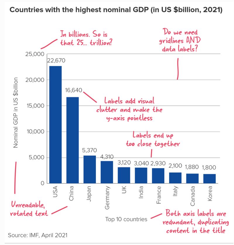
All data visualizations should, first and foremost, inform. Any visualization that falls short of this is simply data art. Data visualizations that are uninformative may be bad but misleading ones are the worst. Here’s an example of a bad visualization that Olga Berezovsky posted on LinkedIn. I thought I’d recreate it based on the suggestions she highlighted.
a bad graph
The dataset
Below is a polars dataframe showing the data I’ll use to recreate the bad graph. This is the original data as it’s shown on the bad graph.
shape: (10, 2)
Country
GDP
str
i64
"USA"
22670
"China"
16640
"Japan"
5370
"Germany"
4310
"UK"
3120
"India"
3040
"France"
2930
"Italy"
2100
"Canada"
1880
"Korea"
1800
Since the GDP numbers will be presented in trillion and not billion, I’ll divide the values by 1,000 and round the values to 2 decimal places. Here’s the resulting dataframe.
I’ll develop the graph in a step-by-step manner, addressing the problems Olga highlighted in the bad graph until we have a perfect graph that is not only informative but beautiful to look at. I’ll use the graphing library called Plotly.
Out of the box plot
Here’s a regular plot without employing any tweaks to make it look better.
import plotly.graph_objects as gofig = go.Figure(go.Bar( x=df["Country"], y=df["GDP"]))fig.show(renderer='iframe')
This regular graph solves the problem of rotated country names, making them easier to read without tilting your head. Another problem that we’ve solve right away is the representation of figures from billion to trillion. However, it’s still not clear from this graph that the values are in trillion. In the next iteration, we’ll add a title to make this clear.
Add descriptive title
The title is an important part of the graph because it tells us what ot focus on. But some titles can be too vague. You wouldn’t, for instance, use a title like GDP of countries for this graph. You want to use a descriptive title – one that tells the audience what to focus on.
fig = go.Figure(go.Bar( x=df["Country"], y=df["GDP"]))fig.update_layout( title="<b>Countries with the highest nominal GDP</b><br><sup><b>(in US $trillion, 2021)</b></sup>", title_font=dict(size=20),)fig.show(renderer='iframe')
Make GDP values explicit
It’s very difficult to know the exact GDP values of the countries by looking at the y-axis. To solve this problem, we’ll insert the GDP value for each country on top of their respective bar. Additionally, I’ll hide the values on the y-axis since they won’t be needed anymore.
fig = go.Figure(go.Bar( x=df["Country"], y=df["GDP"], text=df['GDP'], textposition='outside'))fig.update_layout( title="<b>Countries with the highest nominal GDP</b><br><sup><b>(in US $trillion, 2021)</b></sup>", title_font=dict(size=20), yaxis=dict(visible=False),)fig.show(renderer='iframe')
Remove grid lines
Because we have removed the values on the y-axis, it’s pointless to have the horizontal grid lines. We’ll remove them and we’ll also change the background color of the graph.
fig = go.Figure(go.Bar( x=df["Country"], y=df["GDP"], text=df['GDP'], textposition='outside'))fig.update_layout( title="<b>Countries with the highest nominal GDP</b><br><sup><b>(in US $trillion, 2021)</b></sup>", title_font=dict(size=20), yaxis=dict(showgrid=False, visible=False), plot_bgcolor='#FFE4B5', paper_bgcolor='#FFE4B5',)fig.show(renderer='iframe')
Include source and add padding
Finally, let’s include the source at the bottom of the graph. We’ll also add padding (spacing) at the top and bottom of the graph so that the title text and the source text are not too close to the edge of the graph.
import plotly.graph_objects as gofig = go.Figure(data=[ go.Bar( x=df['Country'], y=df['GDP'], marker_color='#1E90FF', text=df['GDP'], textposition='outside' )])fig.update_layout( title="<b>Countries with the highest nominal GDP</b><br><sup><b>(in US $trillion, 2021)</b></sup>", title_font=dict(size=20), plot_bgcolor='#FFE4B5', paper_bgcolor='#FFE4B5', yaxis=dict(showgrid=False, visible=False), margin=dict(t=70, b=100))fig.add_layout_image(dict( source=f"data:image/png;base64,{encoded_image}", xref="paper", yref="paper", x=0.98, y=-0.26, xanchor="right", yanchor="bottom", sizex=0.22, sizey=0.22, layer="above" ))fig.add_annotation(dict( text="<b>Source</b>: IMF, April 2021", x=0.01, # x position (0 means far left) y=-0.26, # y position (adjust as necessary) xref="paper", yref="paper", showarrow=False, # No arrow font=dict( size=11, # Font size color='grey'# Font color ), align="left" ),)fig.show(renderer='iframe')
Notice that I’ve added the logo for our data consulting company. Contact us if you need any services regarding your data.